Customising the widget
Style, position, colour and wording, all from the builder.
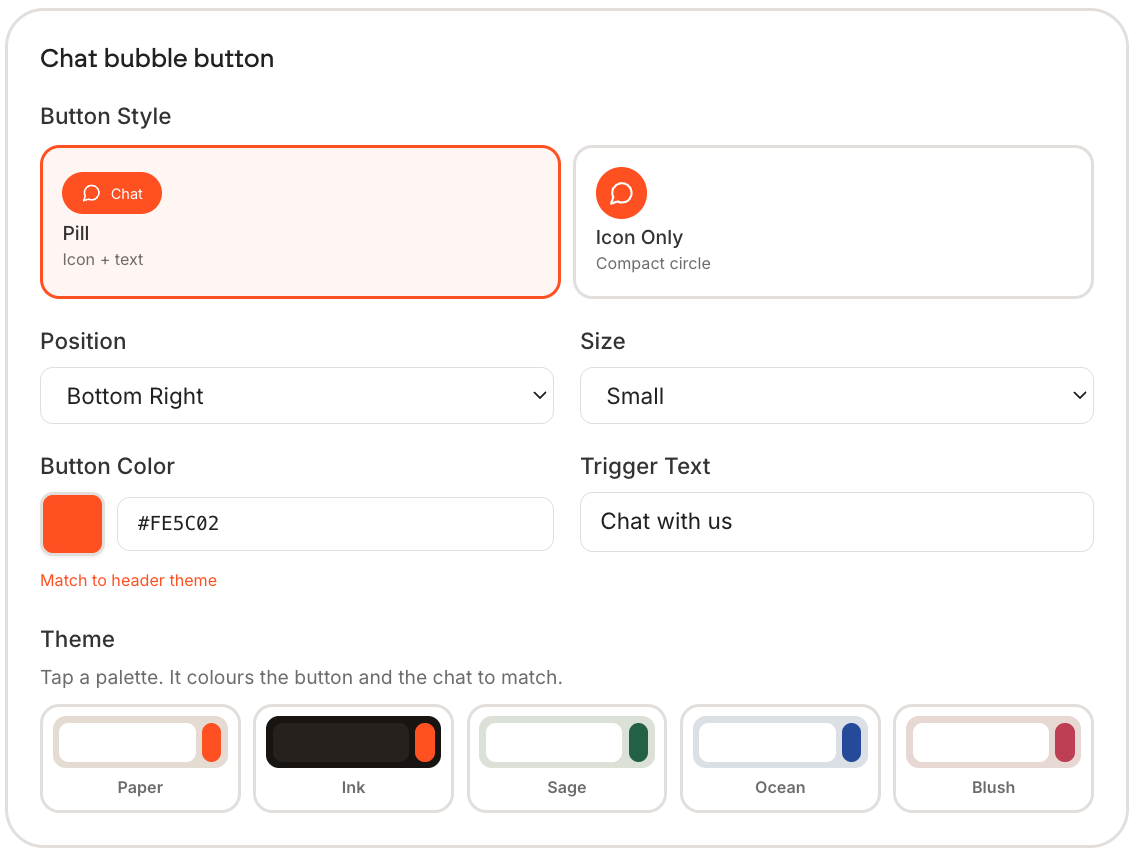
Everything about the button is set in the Your site tab of the Deploy step. Change something and the preview on the right updates immediately.
| Control | Options | Default |
|---|---|---|
| Button Style | Pill (icon and text), or Icon Only | Pill |
| Position | Bottom Right or Bottom Left. Only the two bottom corners | Bottom Right |
| Size | Small, Medium or Large | Medium |
| Button Color | Any hex value | Personify orange |
| Trigger Text | The words on the button | "Chat with us" |
| Theme | Paper, Ink, Sage, Ocean or Blush | Paper |
The button can only sit in a bottom corner. There is no top-left or top-right option, which is deliberate: people look for chat at the bottom of a page.
Two things worth changing
The colour. Use Match to header theme to pull it in line with your page, or paste your own hex. A default-orange button on a site with its own palette looks bolted on.
The trigger text. "Chat with us" is generic. "Ask me anything" or "Ask about the programme" tells people what the button is for, and gets more clicks.
Removing Personify branding
On Pro, switch on Remove Powered by Personify to hide the credit from the widget. There is also a Social Links toggle that shows your links in the chat header.
Restyling the widget does not update a snippet you already pasted. Copy it again and replace the old one, or your site keeps the previous look.